Site redesign time... complete! (sort of)
Oh man this took a long time. I wrote back when I started this endeavour that I thought it'd take just a month of my spare time to complete. As usual, my estimate was way too optimistic, and 2-and-a-half months later (a month-and-a-half over-time (and arguably over-budget)), here we are.
There wasn't any single piece of work that caused me to take so long. I simply wanted to do a lot of things, too many things, all at once. Given that it's been 3 years since my last major site update, I initially started with just wanting to stay up-to-date - updating a lot of my server software (most of it is a major release behind), getting off JSPs and use a real template framework for creating pages, and taking advantage of HTML5 and CSS3. However, in implementing each of those goals, they led to even more things to do.
eg: while updating software, I also went and updated many of the libraries and frameworks my site is built on. A few of them have had major changes done to them (requiring a bit of work on my part to integrate it with my site again), others had simply ceased to exist (leaving me to choose whether to stick with an old version, or find a replacement that was still active).
It was a similar story with moving to use HTML5 and CSS3. HTML5 was mostly an educational thing - learning about the new tags and how to properly use them - whereas my CSS troubles were mostly about trying to get a CSS framework, LessCSS, to run on the server (it's normally run as JavaScript on the user's browser, but the way I was using it, it felt 'right' that I get it to go on the server). I think I'll write another blog post about this in future, since much of what I learned with this latest redesign was from the experiences of other web designers/developers on their personal blogs. It's about time I started posting some of the programming stuff I learned anyway.
A responsive website
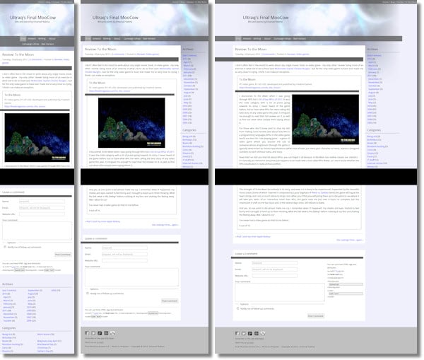
Apart from the change in layout, colour, and typography (thank you Google Web Fonts), the only other thing really worth mentioning is that my website is now a responsive website. What this means is that the layout will change/reformat/adjust itself to the size of your screen, which is especially useful for those of you reading this on a mobile device.
I think this was the main driving force behind my redesign. I've already written about how I thought the old layout didn't look ideal on the iPad, then about how I cringed when I viewed my site on my brother's iPhone, to the point that it really made me understand how terrible the mobile web browsing experience really is. So much so that it made me go and do something about it.
If you're viewing this site on a large screen, then one way you can see how this site adapts to different screen sizes is to change the width of your browser window. If you can't be bothered doing that, here are some screenshots of my site at varying widths:

The only thing I haven't really figured out to further enhance the mobile browsing experience, is how to serve smaller images for smaller screen devices (and lower bandwidth connections). The thing is, nobody has really figured this out, and it's still being actively worked-on and debated. The 'responsive images' community have even enlisted the aid of a few browser developers to help things along and, while the solutions they have on offer so far are really impressive, there still isn't any universally accepted or cross-browser solution. In the meantime, I'm still serving the 'normal-sized' images, having them scale down to smaller screen widths, and sucking-up your bandwidth in the process.
As someone who is also on a rather limited 3G data plan where every KB is precious, this really sucks.
Although I've allowed the site to 'respond' to various screen sizes, I haven't had the luxury of testing across as many devices as I'd like. I was able to test across the usual selection of desktop browsers (Firefox, Chrome, Internet Explorer 7/8/9) on a large desktop screen, but for mobile devices I didn't have that many to choose from. There was my iPad and my brother's iPhone (Safari @ 1024px, 768px, 480px and 360px (and the iPhone may have that Retina display thing going for it, but it uses 4 'real' pixels for every 'virtual' pixel)), and two Android 2.x phones my parents have (stock Android browser @ 480px, 320px, and 240px).
Even with 4 mobile devices, I didn't have the opportunity to test other mobile browsers on Android (although from what I've heard, mobile Opera and Firefox are pretty much on-par with their desktop counterparts), nor did I have a chance to try Mobile Internet Explorer on a Windows phone.
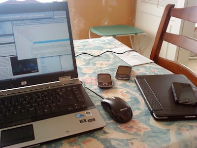
Regardless, it felt pretty cool going home to my family's place one weekend, gathering all our mobile devices, and then testing everything on real devices - it really made me appreciate the challenge of creating a site that still delivered a good mobile experience when you have to squeeze everything down into a display the size of your fist.

Updated wallpapers
Last year I updated a handful of my space wallpapers for widescreen resolutions (Now in 16:10 - Part 1, Part 2). Last month I updated those same ones for 1280x1024, then updated the rest of the wallpapers for both widescreen and 1280x1024:


New/Old stories
As well as the First Dance short story I shared with you over February/March, I've also added another 2 stories (1 old, 1 new-ish) to the Writing section. These are from some long comments I made on friends' Facebook photos, initially as a bit of fun, which became a tad popular with other people (though not always with the recipient):
- Unimpressed face (Frances' photo, January 2012)
- A world of their own (John's and Alexey's photo, April 2010)
More to come
I think that's pretty much it. The only other things that are left to do aren't visible, or only really affect me: some CSS quirks I'm still trying to figure out, and maybe another responsive layout change to better take advantage of widescreen monitors. That, and the usual bug fixes I expect to do after a big piece of work such as this.
Either way, it feels good to finally get this thing out of the way. The large fraction of my year's spare time spent towards this project has made me feel like a recluse, shutting myself up in my apartment, toiling away endlessly working on this website... it'll be good to move on to other hobbies, get out of the building, and see some sunlight for a change.